It's not JUST about the "buy now" button...
Unless you've been living and working under a rock for the past 10 years, you've heard the term "call-to-action" or "CTA" being thrown around by marketers and marketing agencies everywhere.
But, what is an easy to understanding call-to-action definition?
Simple, it's a link or button you place on your website, social media channels, blog, or downloadable content that leads people to take action in order to see what's on the other side.
Website CTAs
On your website, you might have a link that says "learn more," or a button that showcases an event or offer.
For inbound marketers, this is an extremely important tool for engaging visitors, and convincing them to hand over their contact information in exchange for something of value. It's one of the first things I look for when reviewing a new prospect, because no amount of blogging is going to move the needle without them. They provide the next step.
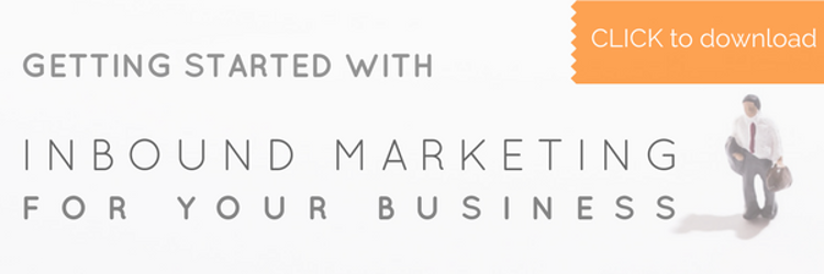
Here is an example of an image CTA we use to promote a guide we created for helping people understand how and why inbound marketing works:
In clicking, people are taken to a landing page where we try to convince visitors to download the content by providing more information about it. This is an equally important step in the process if our goal is leads or anything more than clicks and visits. See below for where the CTA above goes:
Keep in mind, you may actually get different text based on your behaviors on our website in the past... If you marked yourself as working for a staffing agency, it will say staffing, otherwise, it will say something entirely different, and even show you a slightly different graphic. Thank you, Hubspot, and your SMART content capabilities!
Common website CTA formats:
- Embedded (examples used so far)
- Pop-up (click a button to popup a form etc)
- slide-in (CTAs that creep in over the rest of the page)
- Forms (yes, forms are also considered to be CTAs!)
Social Media CTAs
As I mentioned earlier, CTAs are not just for websites. You'll find them on social media as well, and Facebook in particular has done a fantastic job of utilizing this tool.
Here are a couple of examples, including one from our Facebook page and a couple of others we happened to come across:
Orange Pegs: The "Get Quote" button leads to this simple form, and allows people to book a marketing assessment directly through Facebook.
ETC International Freight System: This freight forwarder has a "contact us" button that takes visitors to their quote generating form on their website (they need more information than what Facebook's simple form allows):

LinkedIn isn't quite as simple unless you're a staffing agency, at which point, they actually have some great built-in CTA features for job seekers. But there is another way to add them... If you post an article using their Pulse News feature, you can embed CTAs a variety of ways, and I'll share a live example from the post: How to Improve Your Website Based on What's Really Going On
1. Add an image and hyperlink it
2. Add a link using their link tool (see step-by-step instructions below)
 >
>  >
> 
the result..

3. Hyperlink existing text - a simple and elegant solution:

CONCLUSION
CTAs are a great way to help people advance through their buyer's journey using content and the next steps that you control and create. Check out how we help businesses implement strategic inbound marketing HERE:


